
CFO KPI Dashboards Overview & How to Create One
- Jack Tompkins

- Dec 29, 2021
- 7 min read
Updated: May 21, 2025
If you're a Fractional CFO looking for an additional way to add value for your clients, impress them over your competition, or simply make conversations more productive, a KPI dashboard is the way to go!
You, as a Fractional CFO, probably know the KPIs for your clients more than any blog post is going to tell you, so this is an overview on how to create a KPI dashboard (the stuff that we do at Pineapple) in Excel and Google Data Studio!
Learn about our CFO Dashboards services
Quick summary of the below
KPI dashboards save you a significant amount of time when updating data
They also enhance your conversations with your clients because they form a solid financial foundation for your strategic conversations
Make sure, when building your dashboard, that data gets in "database format" and is easy to update
CFO KPI Dashboards in Excel
Everyone's favorite tool, Excel! Homebase for most finance professionals but not always thought of as a dashboard solution. Excel is great at combining data sources though which is very powerful in creating dashboards.
Obviously, an accounting system like QuickBooks is going to be one data source, but the strategy-focused CFOs will step a bit outside the financial statements and get conversion info, POS data, or some other marketing or operational data to supplement the finances.
The benefit of Excel is that every program can export a CSV of data. The trick is building a system to intake that data and turn it into an updated dashboard.
The purpose of the CFO KPI Excel dashboard
First, showing a large amount of data in a very understandable and clear format.
Second, promoting better conversation. When your client can understand exactly where they are just by looking at a dashboard, the conversation switches to "what should we do next" as opposed to "what does all this mean".
Third, spotting the best and the worst of the business performance. This helps guide the conversation too but really gives the client the beginnings of a strategy roadmap just from a quick glance.
Fourth, they open the door for deeper analysis. After all, dashboards aren't just a pretty picture - they are analytical machines and they touch the surface of the analysis, but they can feed one or two layers deeper of analysis.
CFO Analytics Dashboard: Creating one in Excel
Let's say you want to track your favorite financial metrics off of the income statement, conversions (and conversion source!) from a marketing CRM, and time tracking data from your client's program.
Step 1 - Get the Data into a Database Format
Depending on how the data comes in, there are two ways to make the data into database format.
Complete historical data download
If the CSV you download has all the historical data you need, then this is the easier of the two options.
Simply paste over the previous data, and you're done!
Iterative data download
This is where you have to add the most recent month (for example) to the existing data for all the prior months.
If the data comes in "database format" - meaning every row has columns of information associated with that row (examples below), then you can copy and paste the data at the bottom of the existing data.
If it doesn't come in "database format", then you likely need a macro to put it into the right format.
Unfortunately, most data comes in the iterative data form where macros are an enormous help. Coding macros is an entirely different sort of article, so I won't cover that here.

The goal though, however the data comes in, is to build a very simple, repeatable process to intake the data and get each source into some sort of database format so you can effectively create a pivot table from them.
You'll likely need to add "helper columns" for the dashboard… here are some examples:
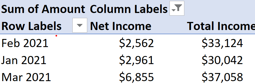
Converting a date into just the month and the year. 1/15/2021 into Jan 2021
Converting text into numbers
Translating a client name in QuickBooks into a Client name in the CRM. This is basically just a translation table with a vlookup formula to find the right name
The more consistent you are between the data sources, the easier it is!
Step 2 - Create the Dashboard
Once you build the pivot table from each data source, then you're just on the dashboard part - the pretty part, but the easier of the two parts!
The GETPIVOTDATA formula is going to be your best friend.
Most times, things are viewed on a monthly basis, so a safe bet is to make a pivot table for each source with "Month" as the rows.
From that starting point, think about what visuals you want to see. KPI headlines, Trend Graphs, Top Clients, Date selector, etc.
For KPI headlines, there are two main factors:
Make sure they can change with whatever date is selected
Make sure there is a comparison to prior month, year, or whatever timeframe you're looking for
Some simple conditional formatting with the up and down arrows does the trick for showing progress

For trend graphs, it's ideal to have them flex between metrics, but not necessary. They should be chock full of info, and typically something like Actual vs Budget.

This is where you have two pivot tables - one Actual, one Budget, and build a separate table based off of those two to get the appropriate months into a table that excel can make a graph from.

Top clients, or anything being ranked (revenue sources is common, too) are good in a horizontal bar chart.
This is where your pivot table has both month and client in it (the pivot table itself doesn't have to look pretty - you won't ever be looking at it), but you can grab the appropriate month by linking to the date selector and the client by the order they are ranked.

I know that is a lot of general overview, but this is the mindset for creating an Excel-based CFO KPI dashboard:
Get all the data into a database format,
Create simple updating processes,
Make sure the data sources can effectively talk to each other,
Pivot the information to feed the visuals that you and your client want to see
Benefits of a CFO KPI Dashboard
All of the above is the upfront work, and then updating will take just a few minutes (less than 10 minutes, almost guaranteed) so there are a lot of benefits...
It's saving you hours of updating each month for each client,
Enhancing your client's experience and understanding, and
Putting you above your competition.
Compiling all of that overview knowledge with a little bit of execution, you can quickly have your very own simple CFO dashboard to use with your clients!

CFO KPI Dashboards in Google Data Studio
For online solutions, I am partial to Google Data Studio and the backend work is fairly similar but it just skips the pivot table step and therefore has a slightly different dashboard creation experience.
CFO Analytical Dashboards: Creating one in Google Data Studio
The overall process is the same as the Excel dashboard above: get everything into database format, make simple (or automated) updating processes, create client-friendly visuals that promote conversation.
Step 1 - Get the Data into Database Format
Luckily, with Google Data Studio, there are a lot of third-party programs that automate dataflow into Google Sheets (a common backend, database storage place for Data Studio). Check out Zapier, Coupler, and other competitors - there are a lot.
Once you see how the data comes in from the automated source, make sure you know if it's all the historical data, or new data that gets appended to existing data. Either way, make sure your formulated columns and metrics can update automatically with it.
Also luckily, these API connectors bring data into Sheets in a pretty database-friendly way more often than not.
All of your data sources will need individual sheets, and then I recommend combining all the relevant info into one master database sheet so you don't have to do that matching and data ETL process in Data Studio itself. This requires you to know your KPIs and visuals (mostly, at least) beforehand. You normally will though.
Step 2 - Create the Dashboard
This is the big difference between the Excel creation and Data Studio creation.
It is kind of a click-and-drag method where you select the visual you want, drag it onto the dashboard, then select what metric, dimension, and timeframe you want for that visual.
It makes it a bit easier in some ways and a bit more difficult in others. The biggest thing I see Excel users try to do in Data Studio is to have one visual talk to another.
Example… in Excel, it's easy to say Net Profit / Revenue = Net Margin. In Data Studio, those two KPIs don't talk to each other. You have to make a calculated field that is more like making a calculated field in a pivot table…. SUM(Net Profit) / SUM(Revenue) and name the field "Net Margin".
There are a fair amount of nuances to Data Studio, but it is fairly intuitive for a lot of the pieces - there are only two menus to select from - Data and Style, and they stick to those properties. If it's not on one, it's on the other, and most things you think of are in there in some fashion.
Always a good addition is a Date Range Selector and you can have that control as many visuals as you want by grouping them together.
Year over year comparisons are tied to that Date Range Selector too and in the Data menu, you can select what type of time period to compare against.

Without going over every visual and all the nuances (this is an overview article, after all), this is hopefully enough to get you started. We're always here for support too!
There you have it! An overview in creating your CFO KPI Dashboard in both Excel and Data Studio!
For more on a finished dashboard product and forecast tool in Excel that I walkthrough, check out this video!
A note on our CFO Dashboard services... we love them! Can't get enough of them and have a whole CFO service page dedicated to them here. Check it out - would love to talk more about them!
Learn more about our custom dashboards:


Comments